YBP Home > Portfolio > Industrial Design > Computers
Computers
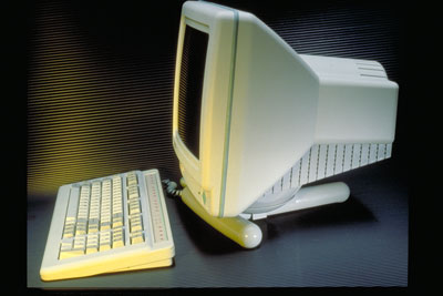
QVT 106 Terminal
Client:
Qume Corporation
Goals:
Branding: Update the design of the QVT 1
Accomplishments:
Designed in 1989, this design of a 12" monochrome monitor has held up well over time. I had completed the entire design, and the molds were being cut, when the engineers changed the CRT supplier. The CRT no longer fit into the housing, but it was too late to radically change the design. Voila! A "speed bump" down the back. This is the first product to use the concept of shrink wrapping over components. It has since been copied by many monitor manufactures since then. What could have been a disaster became another part of Qume's design vocabulary.
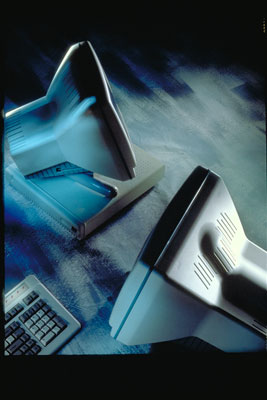
QVT 106 Terminal & QM835 SVGA Color Monitor Top View
Client:
Qume Corporation
Goals:
Branding: Update the design of the QVT 1
Accomplishments:
Top left, is a view of the 12" monochrome monitor showing the "speed bump". On the right, at the bottom is a 15" color monitor. I used the same idea, but extended the "speed bump" up the back to accommodate the anode cap. Again, this made the profile of the terminal much slimmer. The base was a T stand because the P C boards were put into their own CPU case.
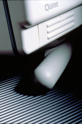
QVT 106 Terminal Detail
Client:
Qume Corporation
Goals:
Branding: Update the design of the QVT 1
Accomplishments:
Detail of the access door to the contrast and brightness controls.
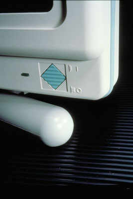
QVT 106 Terminal Detail
Client:
Qume Corporation
Goals:
Branding: Update the design of the QVT 1
Accomplishments:
Small details like this power switch add enough visual interest without distracting from the overall design. The gasket around the bezel and the back housing is functional as well as aesthetic. Molders try to speed up their process by taking parts off before they have had sufficient time to cool. The consequence is that parts with large openings, like bezels, will warp. Often, this doesn't show up until after the product is assembled and the part cracks sitting in a hot cargo container on a dock. My solution was to provide a gasket so the bezel didn't have to be tightened too tightly against the back housing.
QVT 101 & 119 Plus Terminal
Client:
Qume Corporation
Goals:
Branding: Create the smallest terminal on the market
Accomplishments:
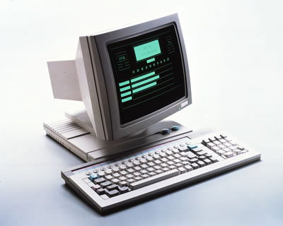
The design of this terminal was so successful, many companies called Qume just to buy the housing alone. It was designed some years ago and was the first project where I wasn't constrained by past products. At the time, Wyse had a best selling terminal - largely because of its size. This was a great opportunity to show off my knowledge of manufacturing and design. To make the terminal small, I put the transformer in the neck adding vents in the neck for cooling. To fit the boards in, the base was elevated in steps. There are two different curved spheres in the bezel to make the CRT look like a flat screen which it wasn't. The keyboard incorporates "M & M" style function keys.
QVT 101 & 119 Plus Top View
Client:
Qume Corporation
Goals:
Branding: Incorporate
Accomplishments:
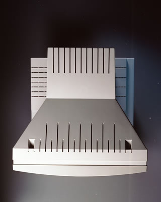
This photograph shows the graphic detailing applied even to the venting. Wherever possible, I applied mathematical equations to determine the proportion of the shape and spacing for vents and base rises.
QVT 101 & 119 Plus Detail
Client:
Qume Corporation
Goals:
Branding: Create the smallest terminal on the market
Accomplishments:
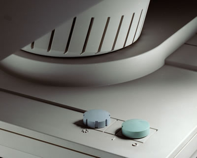
A close up of the brightness and power knobs shows the use of positive vs. negative. The knob is the opposite of the symbol for brightness that is molded into the case.
QVT 101 & 119 Plus Detail
Client:
Qume Corporation
Goals:
Branding: Create the smallest terminal on the market
Accomplishments:
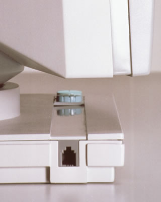
This detail of the keyboard connector shows some of the use of polished and textured surfaces used throughout the product.


