YBP Home > Portfolio > Web Site Development > Intranet
Intranet Web Sites
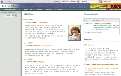
IT Web Site
Client:
Fortune 500 Silicon Valley Corporation
Goals:
User Interface/Graphics: Unify their Intranet consisting of ad hoc sites created by volunteer employees.
Achievements:
When I started at this company as their IT Intranet Manager, all the sites were created independently by whomever volunteered to take on that assignment. Consequently there was no consistency in design, navigation, or site structure. The traffic to the original IT site was minimal at about 500 page views/month. Just after we published a new IT home page, traffic increased by 181% and increased again within a few month by 152%.
My department set up design and navigation templates for all IT Web sites like Telecom and the Help Desk. There were requirements that we followed for each site: The header had to have a top band that would get employees back to the main intranet site, the navigation scheme had to remain the same, but the header graphics could vary some to provide each department with its own branding. This design flexibility made it much easier to get the different IT departments to willingly conform their site to our guidelines.
My staff and I also set up a corporate intranet publishing service plan, publishing process & guidelines, and determined publishing tools, and hosting requirements. We built publishing libraries for site templates, cascading styles, graphics, and programming for corporate intranet sites to use. Many of the following sites deliberately follow the design guidelines.
Note: Most of the text and pictures on the site have been replaced with generic content for confidentiality purposes.
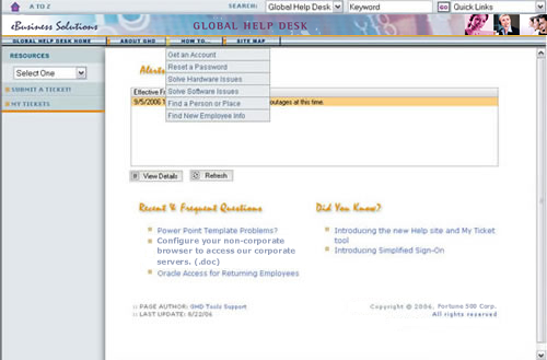
Global Help Desk Site
Client:
Fortune 500 Silicon Valley Corporation
Goals:
Graphics: Integrate the Help Desk into IT master design template.
User Interface: Restructure site so employees could find information easily.
Content: Improve the existing Alert message warning employees of IT issues.
Achievements:
We organized the content into categories based on Frequently Asked Questions having to do with passwords, software, hardware, new employee information, and campus information. In the left column is a small area which is appears on all pages to request a ticket or view open tickets. We "wrapped" the Help Desk Web site around a new ticket application that shows up in the content area so its use is seamless to employees.
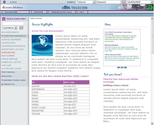
Telecom Web Site
Client:
Fortune 500 Silicon Valley Corporation
Background:
The old Telecom Web site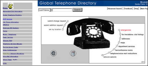 got about 6000 page views per month - not a lot for a large corporation. The Phone Directory which was a separate Lotus Notes database got a lot of traffic, but was mostly accessed through Lotus Notes, not a browser. There were 4 different managers responsible for the services provided by this department. It was very difficult to find information about the any equipment or service because this was another "volunteer" Web site created by employees who were not professional User Interface designers, nor did they really have the time to update the site.
Goals:
User interface/Graphics: Integrate the Telecom Web site into IT master design template.
Restructure site so employees could learn how to use equipment.
Content: Feature news about communications programs completed.
Content Management: Create a simple, inexpensive, easy to use content management process.
Achievements:
The new site gets over 1/2 million pages views per month and is the most used site in the company. To get this result, we scrapped the old site and started over. There wasn't much content that could be salvaged. We pulled the Phone Directory database into an iFrame within the Telecom site. We organized the content around each communication tool. The site now instructs employees on how to use the Communication tools like computer conferencing, web conferencing, and voice mail. Each department manager had access to their content and could update it directly to the server or send it for approval if required. Note: Most of the text and pictures on the site have been replaced with generic content for confidentiality purposes.
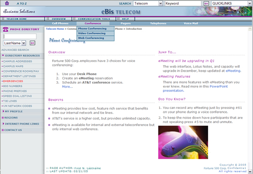
Telecom Conference Pages
An inner page of Telecom's main site, the navigation is based on an interface that is very scalable. There are 3 levels of navigation in the horizontal bar and an additional 2 in the left vertical navigation.
These pages are about Conferencing: Phone, Video, and Web. Each topic has its own sub-topics on the right menu. With each product or service a viewer picks, the menu topics on the right remain as consistent as possible, for example "Using", "Ordering", or "Billing", etc. Note: Most of the text and pictures on the site have been replaced with generic content for confidentiality purposes.
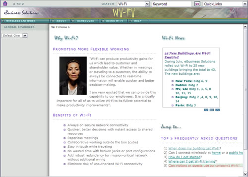
Wi-Fi Web Site
Client:
A Fortune 500 Silicon Valley Corporation
Goals:
User interface/Graphics: Integrate the Wi-Fi Web site into IT master design template.
Change Management: Employee awareness of the company's addition of a wireless network and when their building would be impacted.
Achievments:
The WiFi Initiative was rolled out building by building. Employees were anxious to know when their builiding or region would be included. The Web site had an updated schedule, kept executives abreast of the status, taught employees how to connect while traveling, how to work securely, and answered FAQs. This site was so successful, it remained up and was integrated into the IT Web site. It got about 1500 page views each month depending on the number of buildings converted. The most used pages were "Getting Started", and the building schedules.
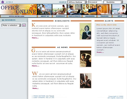
Telecommuting Site
Client:
A Fortune 500 Silicon Valley Corporation
Background:
This corporation began a company-wide program to encourage employees, whose jobs would allow them, to work from home instead of using corporate office space. Silicon Valley is a high cost environment which makes inefficient for some employees to have a permanent office. We put together some concepts of how to educate the employees about the program and its benefits.
Goals:
Change Management: Create a change management site to inform employees about a new work from home program.
Achievments:
The content was organized by the employee's role, e.g. managers who needed to oversee employees in remote locations, employees who wanted to take advantage of the program, and common Training and Help issues.
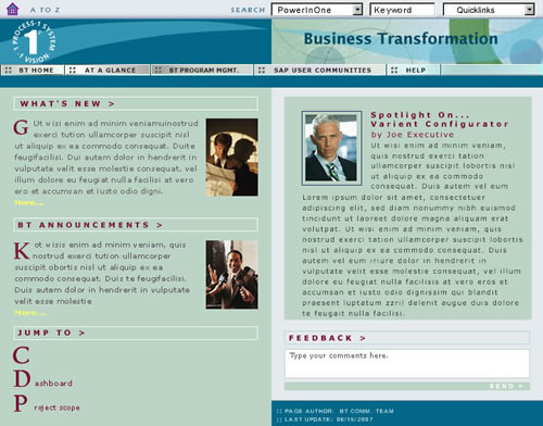
Business Transition Program Site
Client:
A Fortune 500 Silicon Valley Corporation
Background:
This is the largest initiative this corporation has taken on. It changes all the ERP applications for sales, inventory, human resources, etc. from customized applications to out of the box SAP versions. It effects every department and and at least one half of the employees. There was an existing site that was difficult to maintain and had little relevance to the interests of the stakeholders.
Goals:
Change Management: Create a change management site to inform employees about the transition of ERT Applications to SAP
Content Management: Set up a content management system so content owners could update their own pages.
Achievments:
The new BT Web site provides information and background on the project so that it is available to all 10,000-plus end users, project team members, and project stakeholders. The content was divided into the roles employees had with the program. Executives were interested in an overview dubbed "At a Glance". An employee was interested in his/her department applications (like Finance). And all employees were required to take training. The new site helps them know how they are effected by the changes of the BT project. It gives them access to job aids and project announcements, allows them access to end-user training schedules and practice sites, provides go-live readiness information, and helps them acclimatize to the expected changes.
We implemented an inexpenssive application called Contribute and trained the content owners and depatment managers who needed to approve the content on how to use it. Contribute is not a full-fledged content management applicaton, but for limited writers, editors, and approvers, this application is sufficient. The advantages to Contribute are it is easy to use, integrates into an approved Web site development application, Dreamweaver, already on an approved application list, and it is inexpensive. Note: The text and pictures on the site have been replaced with generic content.
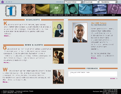
BT Concept 2
Another approach to the Business Transition Web site which correlated with the design of the Office Online site.
IT News Web Site
Client:
A Fortune 500 Silicon Valley Corporation
Background:
Each division was charged a portion of the cost of running the IT department. Most divisions were aware of only the bare essential services provided. The purpose of the newsletter was to improve their understanding of all the services and improvements that IT provided.
Goals:
Promotion: Justify IT expenditure to divisions by marketing IT accomplishments using a Web site instead of an email campaign.
Achievments:
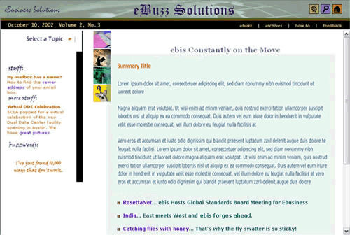
For several years, the IT department sent out a newsletter every other month to the corporation on what was accomplished and to educate employees about IT services. The newletter was dubbed "eBuzz Solutions" - a take off on the department's name. I spearheaded a cross functional team of about 5 to 10 employees to produce this. Playing off the sense of humor of the IT Operations director to whom I reported at the time, we made the content funny, interesting, and added intellectual tidbits like Haiku poems. Very short humorous emails were sent announcing a new publication that encouraged employees to go to the Web site.


