YBP Home > Portfolio > Industrial Design > 3D Modeling
3D Modeling + More
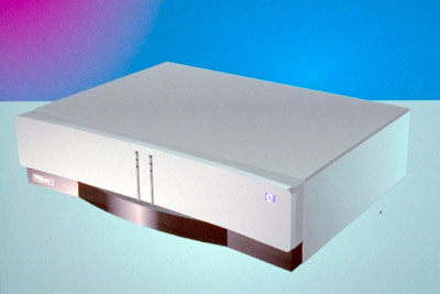
Satellite Receiver 1
Client:
Hewlett Packard Corporation
Goals:
Design: Create a high tech electronic look to reflect the cutting edge technology.
Accomplishments:
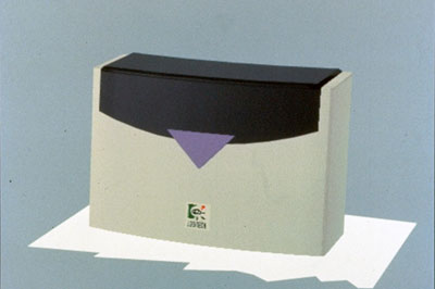
These are 2 of many concepts for a television satellite receiver done for HP. They are all computer models created with a 3D solids modeling program called Topas.
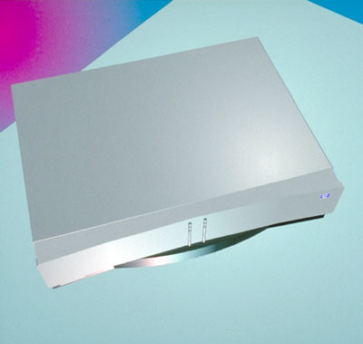
Satellite Receiver 1 - Top View
Client:
Hewlett Packard Corporation
Goals:
Design: Create a high tech electronic look to reflect the cutting edge technology.
Accomplishments:
The 2 columns on the front have LEDs to indicate status of different functions. The black polycarbonate is translucent and allows the remote to signal the receiver.
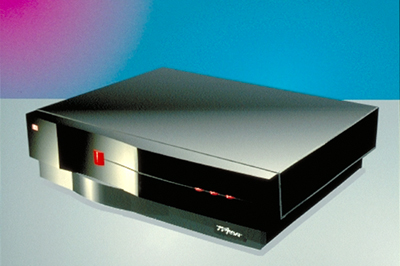
Satellite Receiver 2
Client:
Hewlett Packard Corporation
Goals:
Design: Create a high tech electronic look to reflect the cutting edge technology.
Accomplishments:
Another concept playing concave surfaces against convex and polished surfaces against matte.
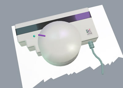
Handheld Scanner 1
Client:
Logitech Corporation
Goals:
Design: Create a compact, high tech look.
User Interface: Create an easy to use handheld scanner.
Accomplishments:
Done in 1990 for Logitech, this was the first project I created completely using a new 3D software application called Topas. I first constructed the inside components -- mirrors, PC boards, etc. in 3 dimensions, then created the outside housing, and finally arranged the components in the housing making any necessary design changes. It is possible to tell very early in the design process if the design is suitable for the component layout.
Solutions to the user interface goals can be found in the sphere that is shaped to conform to a hand. The polycarbonate strip is translucent allowing the paper to be viewed for better accuracy. The steps on the left also make it easier to guide the scanner down the page.
Handheld Scanner 2
Client:
Logitech Corporation
Goals:
Design: Create a compact, high tech look.
User Interface: Create an easy to use handheld scanner.
Accomplishments:
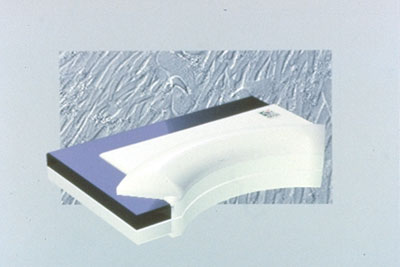
This design is based on the same components as the last, but the outcome is quite different. Because the client can see the design from every angle, it isn't necessary to build expensive models until all design & engineering issues are resolved
Handheld Scanner 3
Client:
Logitech Corporation
Goals:
Design: Create a compact, high tech look.
User Interface: Create an easy to use handheld scanner.
Accomplishments:
Another concept using the same components. The "L" shape part is a black polycarbonate window which is translucent. The user can see through this window to what is being scanned.
Handheld Scanner Concept 1
Client:
Logitech Corporation
Goals:
Design: Create a modern sculptural design that complements their existing mouse.
User Interface: Create an easy to use handheld scanner.
Accomplishments:
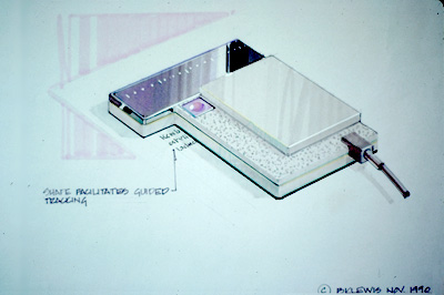
Logitech wanted a new approach to their designs, but one that still related to their existing products. This design reduces the overall thickness of the scanner by stepping the housing around the components. The black translucent. polycarbonate allows the user to see through to the page being scanned. The notch on the left side improves the ability to scan down a page. This series of concepts were drawn using markers and pens.
Handheld Scanner Concept 2
Client:
Logitech Corporation
Goals:
Design: Create a modern sculptural design that complements their existing mouse.
User Interface: Create an easy to use handheld scanner.
Accomplishments:
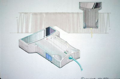
A concept with depressions to fit the palm of a user's hand. A model of the design is necessary to confirm the placement and size of the indentations.
Handheld Scanner Concept 3
Client:
Logitech Corporation
Goals:
Design: Create a modern sculptural design that complements their existing mouse.
User Interface: Create an easy to use handheld scanner.
Accomplishments:
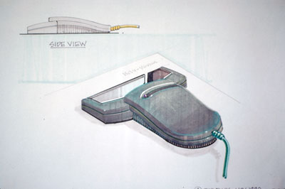
A sculptural concept that adapts to both left and right handed users. A model is needed to refine the shape.
Handheld Scanner Concept 4
Client:
Logitech Corporation
Goals:
Design: Create a modern sculptural design that complements their existing mouse.
User Interface: Create an easy to use handheld scanner.
Accomplishments:
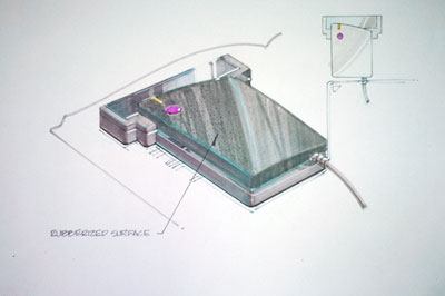
Another sculptural shape meant to be asymmetrical in design. The top is a rubberized surface that is contrasted by the high polished band. The band breaks up the thickness of the scanner so it appears slimmer. The notches on both sides assist the user in scrolling down the page.


